OK, here we go – my review of the SC State Museum’s 20th Anniversary Juried Art Exhibition, on view in Columbia, SC, through Sept. 7, 2008.
This should not be taken as a “professional” review, done by someone who has a degree in art history, art criticism or was educated in writing art reviews. It should not be taken as a review by someone who has been writing reviews for some time. It’s almost a first for me.

Right off the bat I can tell you I liked the exhibit and enjoyed viewing it. I think that it is one of the best examples of a cross-section of the kind of art which is being produced in South Carolina by a wide variety of artists in a variety of media and subjects.
As a juried show where artists had to enter to be considered for inclusion, I realize the exhibit’s limits to be all inclusive or have examples of the best work being done in various media, but since 500 artists submitted 1000 works – I’ll accept the two jurors’ judgment as to what they selected to be in the exhibit – as the only work I see. I know who the two jurors were – Brian Rutenberg and Lia Newman – both I feel make good judges for such exhibitions. I don’t always feel that way about some jurors – some are the last people who should be a juror for an exhibition.
I’ll also add that I have never had a problem finding the SC State Museum (the building, the entrance, the restrooms, or the Lipscomb Gallery) since before it’s opening in 1988. We did a special issue just on the Museum’s opening back then. I’ll also thank the Museum for the free parking – right in front of the Museum. I even found a spot in the shade. A real bonus on the 95 + degree day I was there.
I paid my $5 admission and learned that what used to be Free Sundays, on the first Sunday of the month, was now $1 Sundays, but still only on the first Sunday of the month. But with a little planning you can save $4. It’s all a deal. Try finding a parking space in downtown Charleston, SC, Columbia, SC, or Charlotte, NC, and if you do – hope you get back in time before your meter runs out of time. With free parking it’s almost like free admission.
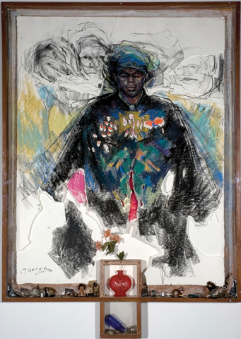
by Tyrone Geter
This was my second visit to this exhibit, so my eyes were already expecting some works as I walked in the door of the gallery. Tyrone Geter’s work, Is This Who You See, jumps right out at you. That title starts you wondering right away. This mixed media piece is an image of a black man in what I say would be African clothing. The work is done in layers of paper, placed in a box frame with items assembled at the bottom. There are several simple drawings of images in the background suggesting – other personalities. As the title might suggest – if we see a black man in African dress – do we form an instant opinion of who he is or what kind of man he is? The objects assembled at the bottom of the box remind me of items that may have been owned by a black child and items that might have been found in a yard – like artifacts found on a visit to an old homesite after being away for many years. Does our dress make us who we are? Do our possessions make us who we are? Does our past make us who we are? The work definitely had me thinking. And, since the piece was dated 2004 – 2008, I imagine Geter had put a lot of time and thought into the work over time too – wondering.
I’ve always found that the first work that grabs my attention in an exhibition stays with me the longest. But, then again, most of Geter’s works that I have seen are very striking – they demand your attention. When you’re finished seeing this exhibit, go over to the Columbia Metropolitan Convention Center – not far away on Lincoln Street. They have another large work by Geter, as well as many other works worth seeing. And, it’s free.
But I have to say, out of the corner of my eye a large work way across the room is calling, but I’m trying to proceed in some order.
If you turn right around you’ll see a couple of examples of Doug McAbee’s brightly painted steel sculptures. I’ve seen his work all over the Carolinas in outdoor settings. They’re always amusing and sometimes a puzzle to figure out what they are or are supposed to be.
Next on the attention radar is the piece Where Were You When the Moon was Full, by Aldwyth. This is a large collage on Okarawa paper. I had to look that up when I got home. Okarawa paper is Japanese paper suitable for student work – according to the internet. I’m not sure that particular type of paper added anything special to the work. If it wasn’t in the title I don’t think I would have wondered what kind of paper it was. Well, here was an image which could have hundreds of stories. The collage consists of cutout images of boats, sea creatures, eyes (1,000s of them), planes, birds, balloons, and hands – which all seemed to be surrounded by a circle of stages of the moon. The entire work was bordered by faces in droplet shapes over some sort of measure of time. There’s a lot of imagery to absorb. I know this was a piece which would be popular with children as the guard had to tell several not to touch it while I was in the gallery.
by Lee Sipe
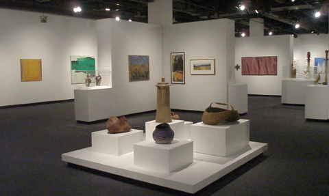
From there was Vessel No. 60 by Lee Sipe. This was an egg shaped vessel open at the top, made of what looked like copper wires wrapped with thread – which was a crimson color. The wires ran from bottom to top. The vessel was sprinkled with what looked like small copper coin-shaped pieces. I’d like to be able to add that work to my collection, but have you seen the price of copper these days?
by Lynne Riding
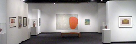
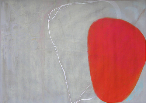
Now I’ve entered what seems like a section of abstract works by a number of artists, with the most dominant work being an oil painting on linen by Lynne Riding entitled, Concerning Hope. This is a 7 ft. by 9ft. abstract work with a large orange shape – which looks like a big glob of the stuff in a lava lamp floating against a milky gray background with some white markings. Before you even enter the gallery you can see this work and it’s saying – look at me! It’s like the 900 lb. gorilla in the room – no matter what you’re looking at – out of the corner of your eye you can see it — demanding your attention.
This is what’s great about the Lipscomb Gallery space. It has big wall space which can take big works of art – look normal – until you get up in front of them. Concerning Hope is not the biggest work in the exhibit, but I’m getting ahead of myself.
At this point I want to revert back to my blog entry on June 6, 2008. This 7′ x 9′ piece is just one of two works Riding had to rent a truck in order to deliver her work to Columbia from Charleston – just for the chance to enter this show. I guess it’s debatable if this work would have had the same impact on the jurors if they saw it as a small jpeg or a slide, but I still think it is unnecessary to ask artists to deliver works to an exhibit space to be juried. We should all know how big a 7′ x 9′ painting would be – the smallest side is way over most of our heads – I mean way over.
In this abstract section was another work which was a surprise. I had to read the label twice but I was looking at a very large mixed media work by Gene Speer, entitled Highway 101 Series. Most of the work I’ve seen by Speer was colorful geometrically designed print works. But, the more I looked at it I could see the abstraction of these works into this painting. I really like it. I’d like to see more of this kind of work. I’ve said it before and I’ll say it again – I’ve got a thing for abstracts. It doesn’t mean I like them all, but I do like them.
Moving on we come to the largest work in the exhibit, About SC, an acrylic on canvas by William Thompson. I’m sure this work came to the Museum rolled up, but it still couldn’t have been easy to deliver – it had to be at least twice the size of Riding’s work – if not bigger. The image is a history lesson of South Carolina by Thompson – as he sees it or knows it. I guess you have to give credit to people who feel driven to create such works, but I just can’t seem to get into “visionary” works of art. In this piece I just don’t think Thompson is skilled enough to pull it off. The images painted on the map are not easy to recognize and there is a lot of writing, which is not all that easy to read. So if there is a message – it is probably lost on viewers who just don’t want to commit the time to figure it all out. There’s a lot of art in the room which is not that hard on the eyes. Other people really get into this kind of work – I just never have. It’s probably my problem and I have no problem with it being included in the exhibit. These artists are part of South Carolina’s visual art community and they should be included in exhibits that are featuring a wide variety of works. Like the WWII movie, A Bridge Too Far, this work may have been too big for Thompson to handle in his normal style.
Man Power, an etched copper and brass half sized figure of a man by Mana Hewitt was a clever reproduction of one of those old time illustration of looking inside something to see how it works. It’s usually a machine, but this man was full of gears and machine parts. His brain was filled with the word “Power” and some other sections, but I was too short to be able to read them. (The work could have been hung a little lower.) His heart was money. Is this an indictment on man? Is it the way employers see their workers or is this a look inside the head of the boss man?
I’m not mentioning some works in the exhibit because I feel I’m too biased towards these artist’s works – some are in our art collection. Some of the artists I consider friends. This may not be fair to them, but I think most of them know how I feel about their work and I hope they can understand me not gushing about them here. It’s also nice to see that my own taste in art is matched by a couple of good jurors too. Besides I’ll find other ways to express my support for their art.
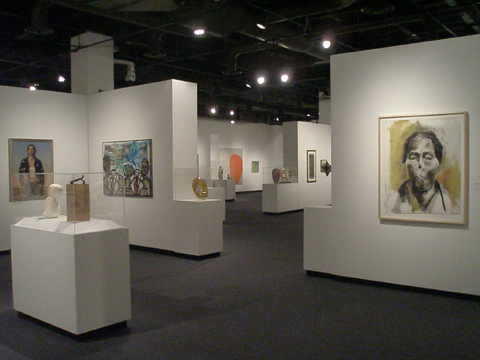
There are 122 works in this exhibition and I’m not trying to write a catalogue – I want people to go see it themselves. So here are some general thoughts on the exhibit.
To me, the abstract works were the strongest group of works in the exhibit. There was also a strong group of sculptures of all sorts. There is an excellent grouping of portrait paintings and drawings. Also there were some very interesting baskets and pottery pieces, but I felt that overall crafts might have been under-represented. And, I hate to say it but the photography in the exhibit – to me – was the weakest medium in the exhibit. There were some good photographs, but some not so good too.
Some works, I don’t mind admitting – go right over my head. They’re interesting to look at in an exhibit – they add the spice of life. I know they have a message, but I’m not receiving it. That’s OK with me. Like the workFuture Dust by Mike Lavine. It’s a button on the wall – like a campaign button with Future Dust printed on it and below is a child’s chair. That’s the work. Maybe someday I’ll be somewhere and the light bulb will go off and I’ll get it – maybe not.
There were some surprises in the exhibit. They shouldn’t be a surprise, but with the history of the Triennials (see previous blog entries) behind us and track record of other institutional exhibitions I hate to say it, but seeing some works in this exhibit did surprise me. More to the point – it was certain mediums and subject matter. That’s a good thing.
But, my biggest surprise was when I turned a corner and was facing a work rarely seen in our state in the last 38 years. It was Wisteria at Rose Hill State Park, a mixed media work by Bill Buggel. I came to South Carolina in 1974. In a few years I was working in a custom black and white photo processing lab. One of my bosses was Bill Buggel, who also operated a t-shirt printing business next to the lab. I knew Buggel was an artist and at one time worked at what was at the time the Gibbes Art Gallery in Charleston. He once told me he was no longer an artist because he could make more money designing and printing t-shirts. A few years later I got an opportunity to see some of the work he created and learned that in 1970 Buggel was named one of South Carolina’s most promising artists. That promise led to frustration – in playing the game – the art game. The game of it’s not what you create – it’s who you know and kiss up to.
I knew Buggel has been creating works again in the past five or so years, but he was having a hard time breaking back into the art community. So, there was a Bill Buggel on the wall in front of me. He made the cut of 116 out of 500. I bet you Buggel couldn’t get a return call from the SC Arts Commission. They don’t know any artists who may have been in their heyday in the 1970′s.
And, that’s another good thing about this exhibit – it seems the State Museum has thrown out all the old prejudices of the past 20 years dictated by the SC Arts Commission as to what art can be shown and what art will get grants. Let’s just hope we don’t have to wait another 20 years for another exhibit like this.
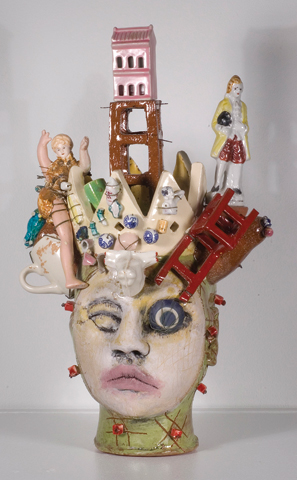
by Peter Lenzo
OK, against better judgment I’m going to name (some) of my favorite works in the exhibit not mentioned previously. They include: Red Chair Alter – Jim is Dead by Peter Lenzo; SC Woman No. 2 by Meg Gregory;Three Receptivity Markers by Robert Lyon; Universal Bouquet by Enid Williams; Three by Brittany Bagwell; Weather Worn Boulder by Clay Burnette; Peaches by Wanda Steppe; and American Idle by Anthony Conway.
American Idle is like a portrait of a really nice young woman, but she’s probably a trailer park gal. In the background is a billboard, a water tower, power lines and a trailer. A nice pun on America’s top television show.
That’s it folks – go see this show. And, if you like it, let the SC State Museum know so they’ll be encouraged to do more like it.
Also since you’re going to Columbia, if you don’t already live there, plan for a day and go visit the Columbia Museum of Art and some of Columbia’s commercial galleries too.