I go for the Hammershøi’s. I have had a strange, stressful day and so want to be soothed by sparse, intimate interiors painted solely in gray scales. I expect to be held by drab tones so varied and delicate, yet powerful they ought to be colors. And so I enter the National Museum in Denmark, which hosts an ambitious show of that master of any tone ashen.
Through all times, artists have produced heaps of gray scale paintings. Whether to study a composition’s tonalities or out of budget constraints, colorless works were, and still are produced in abundance. Though, far from always well done. By his death in 1911, however, Vilhelm Hammershøi had the middle-toned palette down pat. Something also verified at Sotheby’s on June 11th 2012, where his works made a stir when selling for well over double the estimate. Ida Reading a Letter, oil on canvas, 26 by 23¼in, fetched US$ 2,677,232.
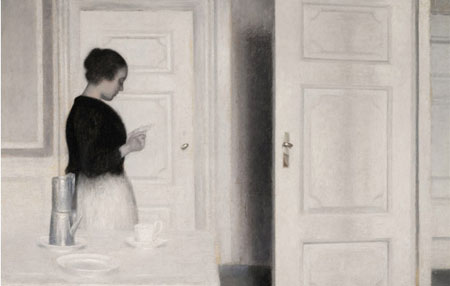
“Ida Reading a Letter,” by Vilhelm Hammershøi
In these economically uncertain times, the auction house set a record for highest paid Hammershøi – and any Danish work. The money talking apparently predicts gray is not only the new black in fashion. Perhaps this grand attention to an artist with profound consideration for simplicity foresees that, even in our disgruntledly greedy world, a more sensitive spirit is emerging. Perhaps.
But I cannot stand among Hammershøi’s luminosity and confirm beauty overrides avarice. My memory has served me wrong. The show of the Danish painter closed the week prior to my visit home. I enter the National Museum’s halls deflated, like I have been stood up. But, in one of the first rooms I meet contemporaries of Hammershøi, Emil Nolde (b1867-d1956) and Jens Søndergaard (b1895-d1957).
Their bright-colored applications are so layered they appear dark, but far, far from dismal, despite the themes: Workers stream wearily down a cobblestoned street at workday’s end from a factory. There they have toiled under conditions we can no longer fathom. Though, work drains us of energy now, too. We also stagger home in search for respite, before we will be at ‘it’ again. However, Nolde’s men still radiate pride over their purposeful employ earning them wages.
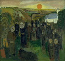
by Jens Søndergaard
Søndergaard depicts a family mourning a drowned fisherman. Maybe it is the one then being buried in the next painting over: In front of a hillside landscape, with an orange sun heading for its hideaway, a congregation bids farewell. Those gathered stand solemnly and sad, of course. But also accepting, I decide. Death being part of life, Søndergaard places a white church off to the side, tucked in among trees, as a light in an otherwise dark landscape.
by Jens Søndergaard
An elderly couple, on the bench next to me, unwrap caramels and start chewing while remaining peacefully fixed on the burial scene. They look a sprite couple, despite age bringing on fatigue, as well as the need for a cane and orthotic shoes. Wrinkles run into what is left of their white hair. The scene, however, does not to faze them. They seem to recognize time honestly spent.
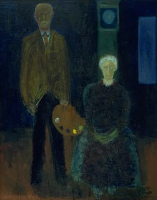
I follow their gaze on to the artist’s self-portrait, where Søndergaard truly masters layering, as was it time. He stands next to his seated mother. Like the couple on the bench, the pair on the canvas glow from gratification. They know the past can never be taken away. However, the artist’s mother is aligned in front of a grandfather clock. Its dial matches her whitish hair. She looks as if she is being beamed up; about to be extinguished from her son’s life.
I imagine he has also painted her on her deathbed, using somber tones and grays, but also dabs of brilliant pigments—as what sits on the palette in his hand – filling the canvas with life that was and is, and will remain. Because, as he stands by her side, we feel they have both lived, no matter how sadly or painful or hard.
Life is not all sunshine, not then, not now. Though playing a pun: Charleston gets its share. Bleak as we may consider this era—the tourist dollars roll in only slowly, nor does the real estate market roll on—should we add more color, so to speak? Should we get over the hump by living even more intensely?
Time is what we make it. But since it does not stand still, perhaps, just perhaps we should take care to consider its finer nuances, before they bleach out.
If we surround ourselves with hectic, bold vibrancy – and yes, I race on with a metaphor connecting an overtly, colorful life and one depicted in something hanging in our homes – then do we notice anything, any detail? Sweet toffee in our mouth; a sun just breaking over the horizon; a partner remaining patiently by our side; a job having meaning because we helped someone, not because we got a raise? No. Subtleties drown in the bemoaning over what we have not and pooh-poohing those we think have more.
We look for luster. But trying to ‘live a little’ should be many things. ‘Little’ could be something simple, like a quiet evening with tea and no telly, or a subtle painting. Not the retina-grating, pyrrole or quinacridone red-tainted style popular also with Charleston tourists.
We do not have to buy the likes of Hammershøi. There are living artists, who pursue and seize deep contemplation. Aggie Zed comes to immediate mind, as does Michael Johnson’s photography. He is the current show at Nina Liu and Friends—a preeminent gallery that may have a ‘for sale’ sign on the side door, but it is, fortunately, very much open. Or, Jim Innes, represented by LimeBlue, though not currently up. Some LePrince works fit the bill; not all are eye-poppers. That can also be said for Ann Dettmer and Anna Schalk, at Mary Martin Gallery. When they leave the sharp orange tubes unopened the canvases turn out quite nice. Martin’s stars are Jim Pittman and Santiago Perez. As are Bo Joseph and Leo Twiggs at Rebekah Jacob Gallery, as well as Jessica Dungan and KC Collins at Robert Lange Studios. And real heartbeats are also found at Redux Center for Contemporary Arts and, of course, at the Halsey Institute at the College of Charleston.
Less colorful art takes a moment longer to catch your eye, because the message is not in-your-face. Contrary, it has the potential to reach you, truly and deeply. Not that we have to completely pare down our daily grind into gray nuances in order to appreciate art. But when the stark sun scorches; rush hour stalls, while our mind races to the appointment for which we are late; dates disappoint; markets yo-yo into red; we eventually do need to settle in our couch. Then it would be desirable to stare onto our walls and find respite, not be additionally overwhelmed by the neon of modern life.
Born in Denmark, Pernille Ægidius Dake’s ties to the Carolinas include an exchange student year in Richlands, NC when she was 16. Then in 1989, with a BA in Studio Art and a Masters in Marketing, she moved permanently to the US. From 1996 until 2002, she lived in Charleston, SC where her arts career included the 1997 Piccolo Spoleto Poster, while also completing a Masters in Art Advocacy from Skidmore College, NY. Currently a resident in Upstate New York, she returns to visit Charleston often… when not in Copenhagen, Denmark, or other favorite places like Lisbon, Portugal and Sydney, Australia.